Modernizing TD Bank’s Mobile App for 7M+ Users
Due to NDA restrictions, only public-facing assets have been shared. Feel free to reach out if you'd like to hear more details in person or over coffee (virtual or otherwise).
In a multi-year collaboration with TD Bank—one of North America’s largest financial institutions—I was brought on board to elevate the user experience and visual design of their mobile banking app, used by over 7 million+ users. My role involved translating complex financial flows into intuitive, user-friendly designs, aligning with accessibility standards, and ensuring consistent branding across platforms. From modernizing outdated sections to refining core banking features, I worked closely with cross-functional teams to ship impactful solutions that improved product engagement and user satisfaction.
Client
TD Bank
Year
2022-2025
Services
UI/UX, Product Design
I was appointed as the UI/UX Designer for the "Modernization" Pod, a dedicated team focused on overhauling the visual and interactive experience of the TD app’s core features.
This included:
Redesigning critical user flows such as financial product discovery, account activity, and transaction management.
Collaborating closely with cross-functional stakeholders—including UX leads, product owners, developers, QA, accessibility experts, and legal teams—to ensure compliance, performance, and seamless user experiences.
Developing Figma prototypes, design system components, and motion prototypes while maintaining alignment with TD’s brand and accessibility standards.
This work set the foundation for a more cohesive, scalable, and user-friendly app experience across iOS and Android.
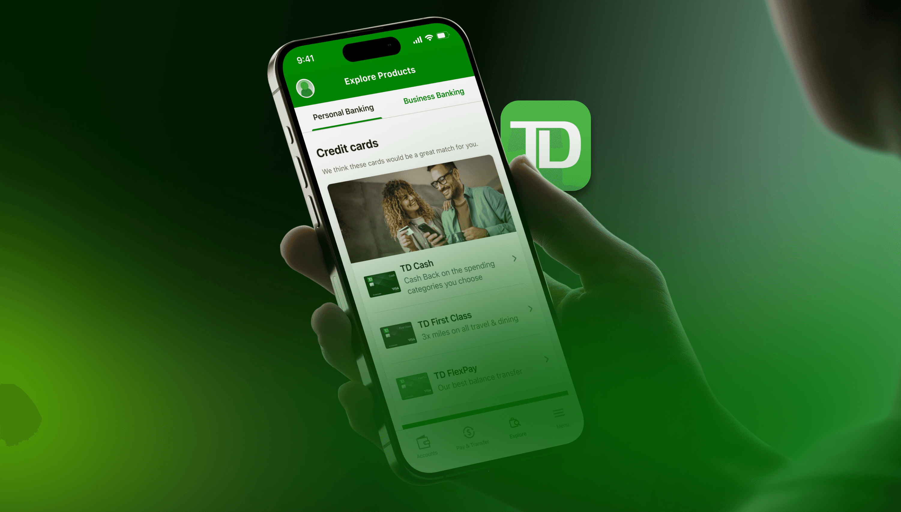
🛍️ 1. Financial Product Discovery (Shopping) Redesign
The Challenge:
TD’s "Shopping" section—where users explore financial products like credit cards, loans, and savings accounts—felt outdated and cluttered.
Low engagement rates: Most users exited the page within 10 seconds.
Confusing CTAs and inconsistent layouts made product comparison difficult.
The visual hierarchy lacked clarity for users navigating complex financial options.
My Approach:
Competitive Benchmarking: Analyzed product discovery flows of top-tier apps (Chime, Revolut, RBC, Monzo) for best practices.
Low to High-Fidelity Prototyping: Translated early wireframes into polished Figma prototypes—responsive for iOS and Android, with platform-specific UI nuances.
Collaborative UX Reviews: Worked closely with the UX lead, presenting interactive prototypes to stakeholders and refining based on feedback.
User Testing: Supported A/B testing with over 20+ participants, iterating on navigation, filter components, and product cards for optimal clarity.
The Solution:
Modular Card System: Created flexible, scalable card components that could adapt across TD’s growing product catalog.
Sticky Filter Bar & Action Chips: Introduced persistent filters to enhance discoverability.
Enhanced Visual Hierarchy: Clear CTA buttons, intuitive icons, and color-coded product categories for better scanning.
Impact:
Engagement Time: Increased by 35% on average.
Bounce Rate: Dropped by 28% within 60 days of rollout (internal metrics).
User Feedback: Positive sentiment in post-launch surveys—users found it "easier to explore options."
💸 2. Account Activity Revamp — Making Transactions Make Sense
The Challenge:
Users struggled to view and filter transactions efficiently. The legacy layout buried key information like pending transactions, categorized spending, and statement downloads.
My Approach:
Heuristic Evaluation: Conducted a heuristic analysis to identify friction points.
Bottom Sheet Pattern Exploration: Proposed modern interaction models for deeper transaction details without disrupting the main flow.
Design System Expansion: Extended TD’s atomic system to support new components like action chips, filters, and segmented controls.
The Solution:
Filter-First Design: Introduced segmented filters ("All," "Deposits," "Transfers," etc.) for intuitive exploration.
Bottom Sheets for Details: Allowed users to view detailed transaction info inline, reducing back-and-forth navigation.
Statement Download Module: Designed a visual timeline view for statements, with easy download/print options.
Impact:
Reduced Task Completion Time: By 20% for statement access tasks (usability testing insights).
Improved Accessibility: Achieved full WCAG 2.1 compliance for the new components.
📸 Media Suggestions:
Flow diagrams showing the user journey before and after.
Screenshots of new components in use (e.g., filters, bottom sheets).
Accessibility compliance badge or visual indicator.
🖼️ 3. App Store Graphics Refresh
The Challenge:
TD’s public-facing App Store and Google Play visuals were inconsistent, outdated, and didn’t reflect the modern app experience.
My Approach:
Brand Alignment: Collaborated with marketing and brand teams to ensure visuals reflected TD’s visual identity and accessibility standards.
Cross-Platform Adaptation: Created assets optimized for different aspect ratios and screen sizes across iOS and Android.
The Solution:
Fully Redesigned Screens: New, high-contrast, ADA-compliant graphics with clear captions, mockup device frames, and engaging color gradients.
Consistency: Established a repeatable template system for future marketing updates.
📈 Impact:
Boosted TD’s App Store and Google Play Store ratings.
Increased downloads post-visual refresh (according to app analytics).
Enhanced brand perception across digital platforms.
🎬 4. Expo Graphics & Motion Prototypes
The Challenge:
For an international fintech expo, TD needed large-scale, print-ready banners and motion prototypes to showcase mobile banking innovations under tight deadlines.
My Approach:
Scalable Vector Graphics: Created high-resolution assets adaptable to both digital screens and physical banners.
Motion Design: Developed looping animations that showcased TD’s app features in an engaging, digestible format.
Outcome:
Delivered all assets within a one-week sprint—praised by leadership for creative problem-solving and speed.
The expo display was later repurposed for internal town halls and training sessions.
📸 Media Suggestions:
Expo banner mockups in situ.
Looping video of the motion prototype.
Photos of the actual expo setup (if available).
🌟 Final Reflection
Working at TD Bank sharpened my design thinking, problem-solving, and collaboration skills. I helped modernize a mobile banking platform used by millions, contributed to a cross-platform design system, and shipped designs that improved user experience, accessibility, and engagement.
Snaps From the Project


Senior product manager, TD Bank