TD Bank's mobile app serves millions of users across Canada and the U.S., making it a mission-critical product with high expectations around performance, reliability, and experience. When I joined the modernization pod at TD, our north star was clear: modernize the mobile banking experience without disrupting the familiarity users rely on.
We wanted to go beyond polishing visuals. We aimed to create a visually consistent, intuitive, and responsive experience across both iOS and Android, built atop updated HIG and Material Design principles.
Our team of designers, engineers, and researchers worked in lockstep to roll out this transformation incrementally across multiple releases from 2022 to 2025.
This case study highlights two major redesigns: Account Activity and Explore section (Shopping).
Client
Year
Services
For every redesign or feature shipped, we followed a rigorously collaborative and iterative process:


Both redesigns were deeply collaborative efforts across multiple teams, each contributing to different phases of execution:

UI/UX Designer
🧠 Design Team – Modernization Pod
Developer Handoff + QA
💻 Developer
Team

Prototype Management
🧪 User Testing
Team

COLLABORATION
I coordinated closely with a Developer Project Manager, native iOS and Android engineers, and QA for implementation QA via Jira. I also worked directly with the User Testing team—managing Figma prototypes and gathering user behavior feedback.
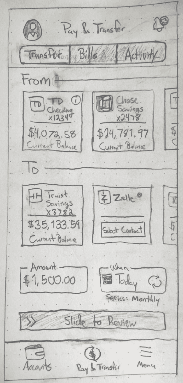
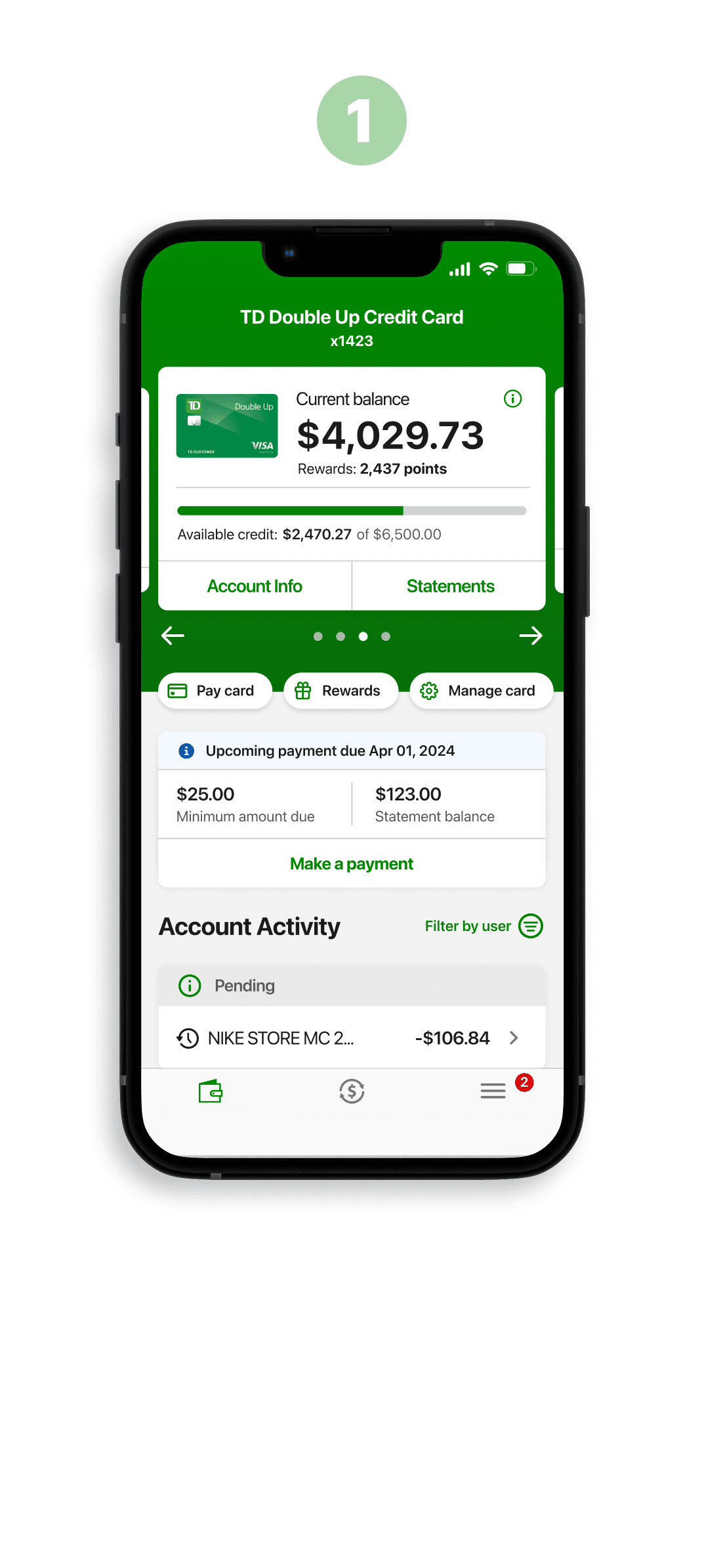
1. Account Activity Redesign
Cluttered layouts → Transactions were presented in dense lists with poor spacing, making it hard for users to quickly scan or differentiate between them.
Inconsistent grouping → Multiple accounts (chequing, savings, credit, etc.) were displayed in long, stacked lists, forcing users to scroll endlessly to find the right account.
Slow task completion → Users had difficulty locating a specific transaction (e.g., “Where is my last payment?”), leading to frustration and extended time-to-task.
Compliance conflicts → FDIC-required banners had to be visible but were visually intrusive, adding more clutter to an already dense screen.
Cross-platform inconsistency → Different visual treatments on iOS vs Android created friction and lowered trust for users switching devices.
Accessibility gaps → Contrast issues, small touch targets, and lack of hierarchy made it harder for some users to confidently review transactions.
User trust erosion → Confusing layouts sometimes led users to believe transactions were missing, resulting in unnecessary calls to support.
Business Goals
Reduce support tickets — simplify UI to lower confusion and customer service costs.
Increase engagement with key actions — drive use of payments, statements, and paperless features.
Establish scalable UI patterns — create modular components to speed future development across account types.
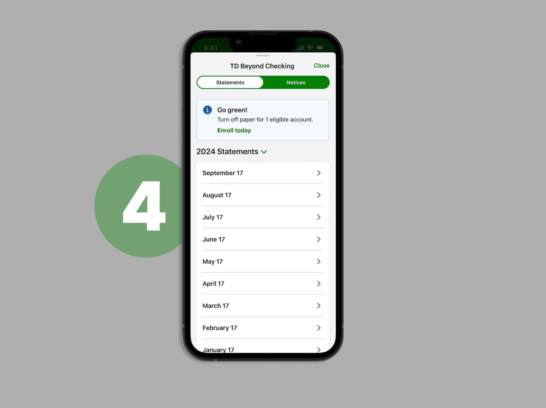
Promote eco-friendly behavior — increase paperless enrollment with a clear, friendly CTA embedded in user flow.
User Goals
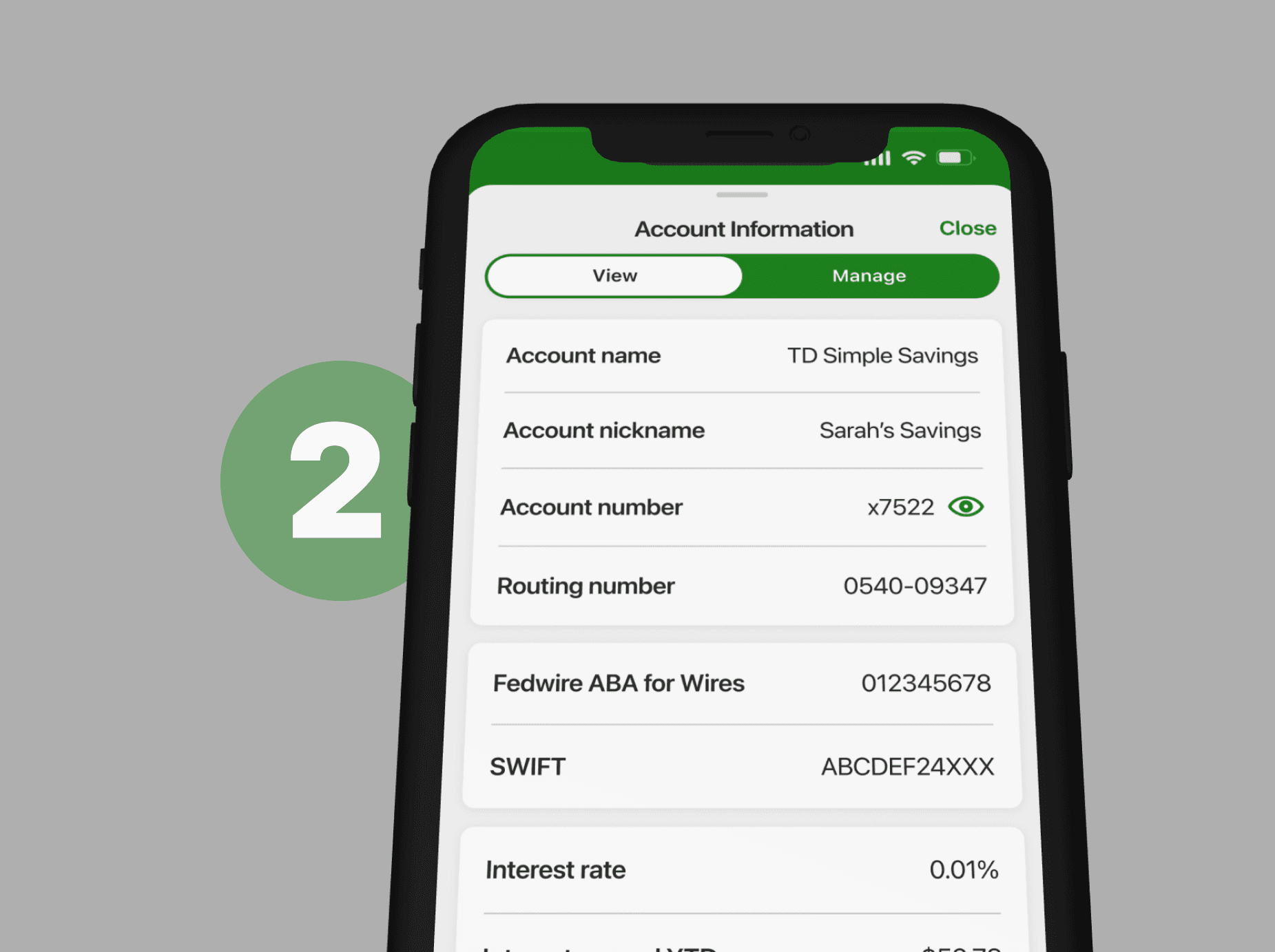
Quickly scan transaction activity — users needed to understand their financial activity at a glance, without cognitive overload.
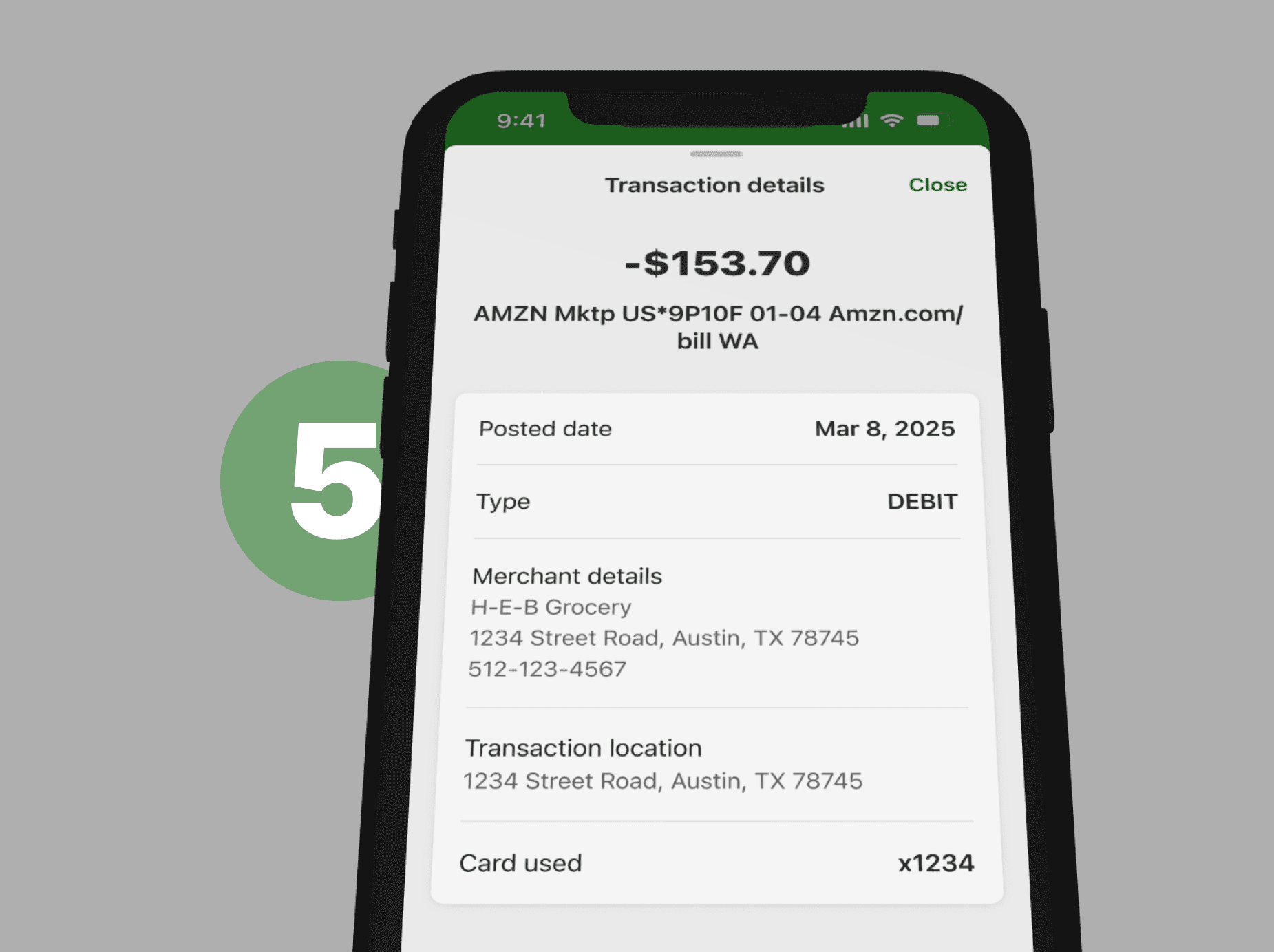
Access detailed transaction info easily — including date, merchant, location, and card used.
Feel confident handling sensitive info — toggleable account and routing details made users feel secure.
Navigate accounts intuitively — seamless flow between account type, details, and actions.
REFLECTION
By simplifying the layout and elevating contextual clarity, we met our user needs—swift scanning, confidence, easy access—while helping the business reduce friction, scale design, and drive behavior change.
A visual walkthrough of the end-to-end design process behind the Account Activity redesign
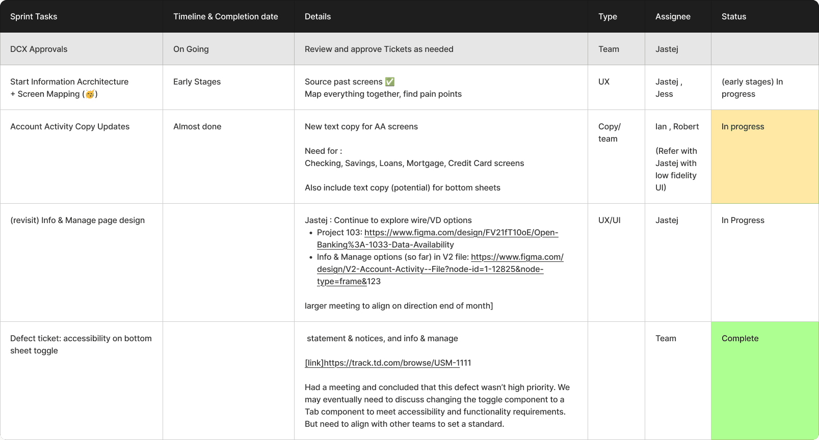
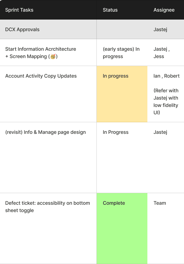
1. Sprint Planning & Task Breakdown
We began with structured sprint planning to align product, design, and engineering teams.
Each feature—whether a new component, layout update, or UX improvement—was broken down into Jira tickets. I worked closely with our product manager and dev lead to scope my design responsibilities and assign tasks across our modernization pod.
Role
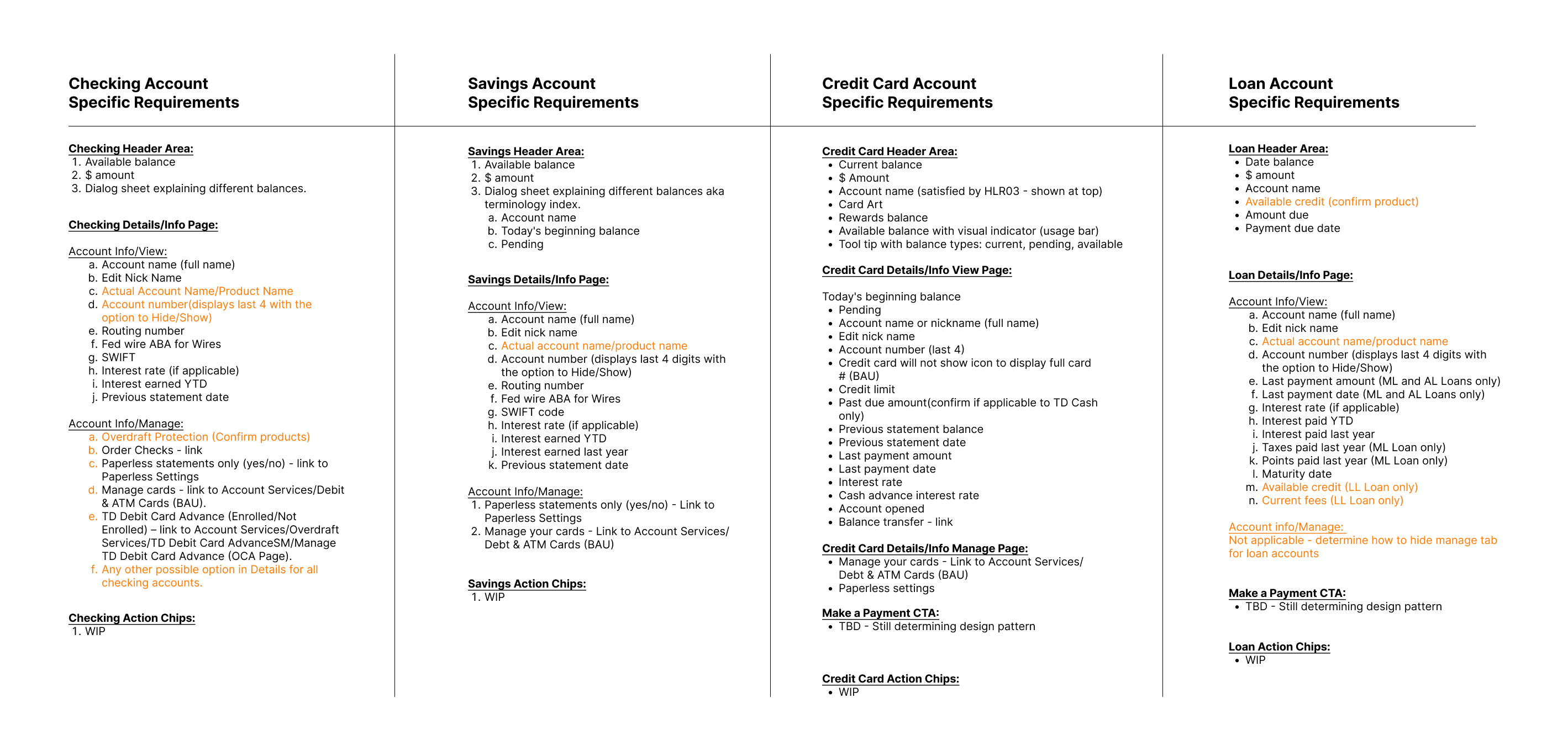
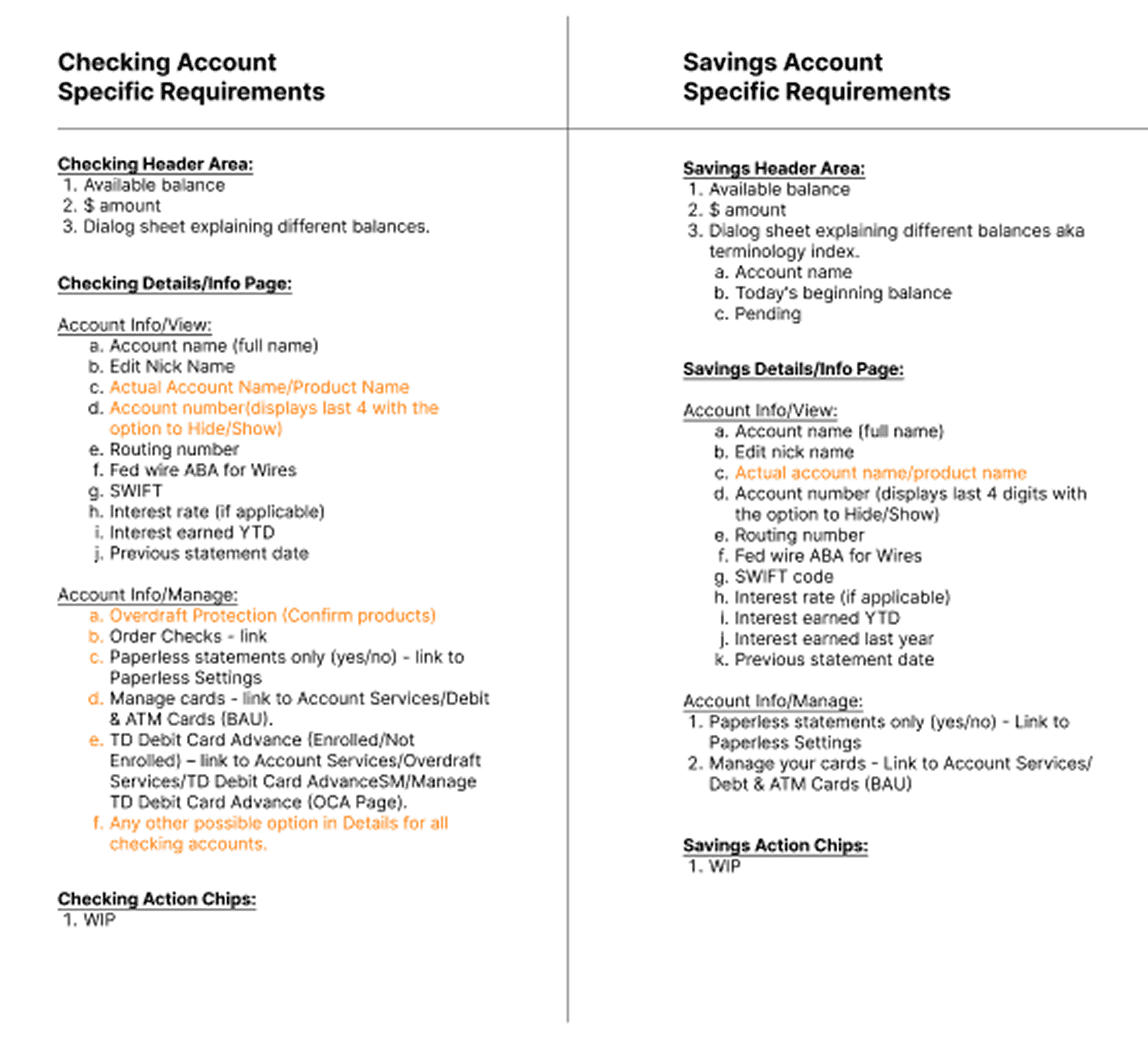
2. Requirements Mapping by Account Type
Each account type came with its own set of business and user requirements. We mapped these out early, ensuring that the redesigned UI would accommodate key data like:
Available balance & account number
Transaction filters
Paperless settings
Interest details
Deep-dive transaction metadata
REASON OF USE
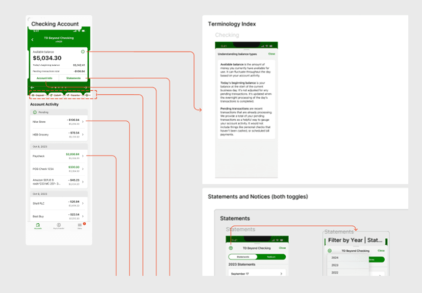
3. Information Architecture (IA) Planning
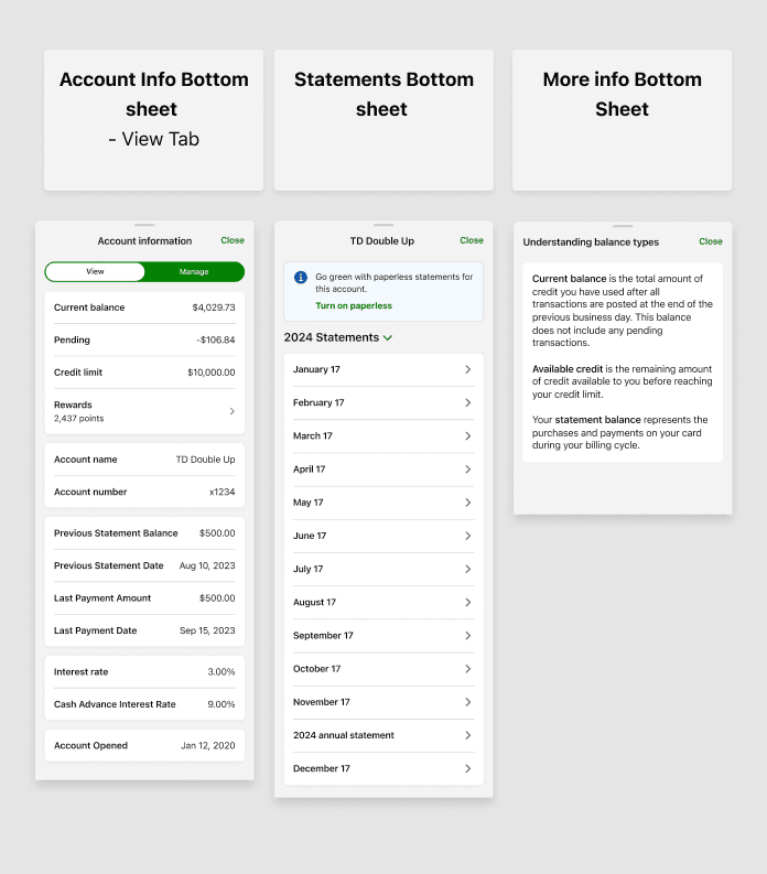
We created detailed IA maps for each account type, laying out all feature areas, bottom sheets, and deep interactions. This helped define our navigation structure and clarified where each bottom sheet lived within the larger app flow.
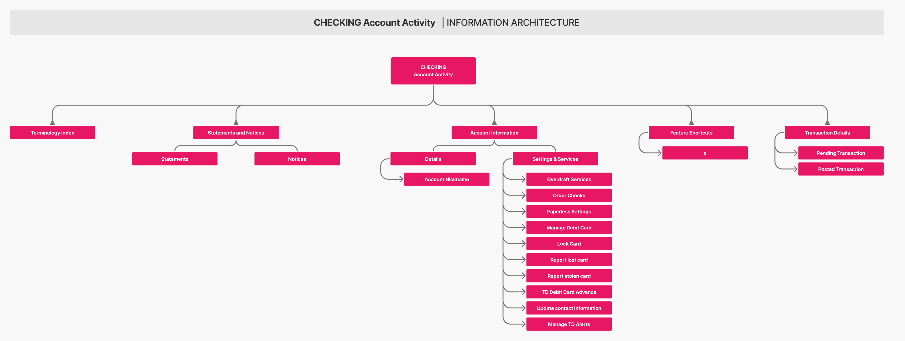
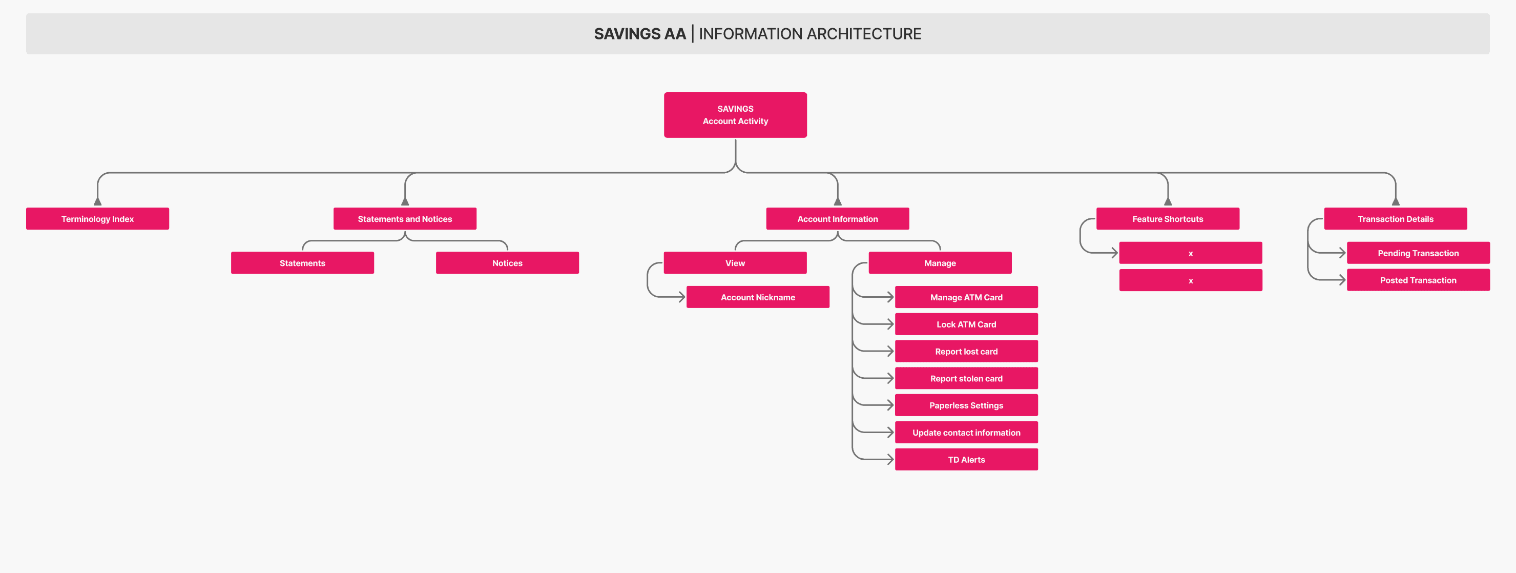
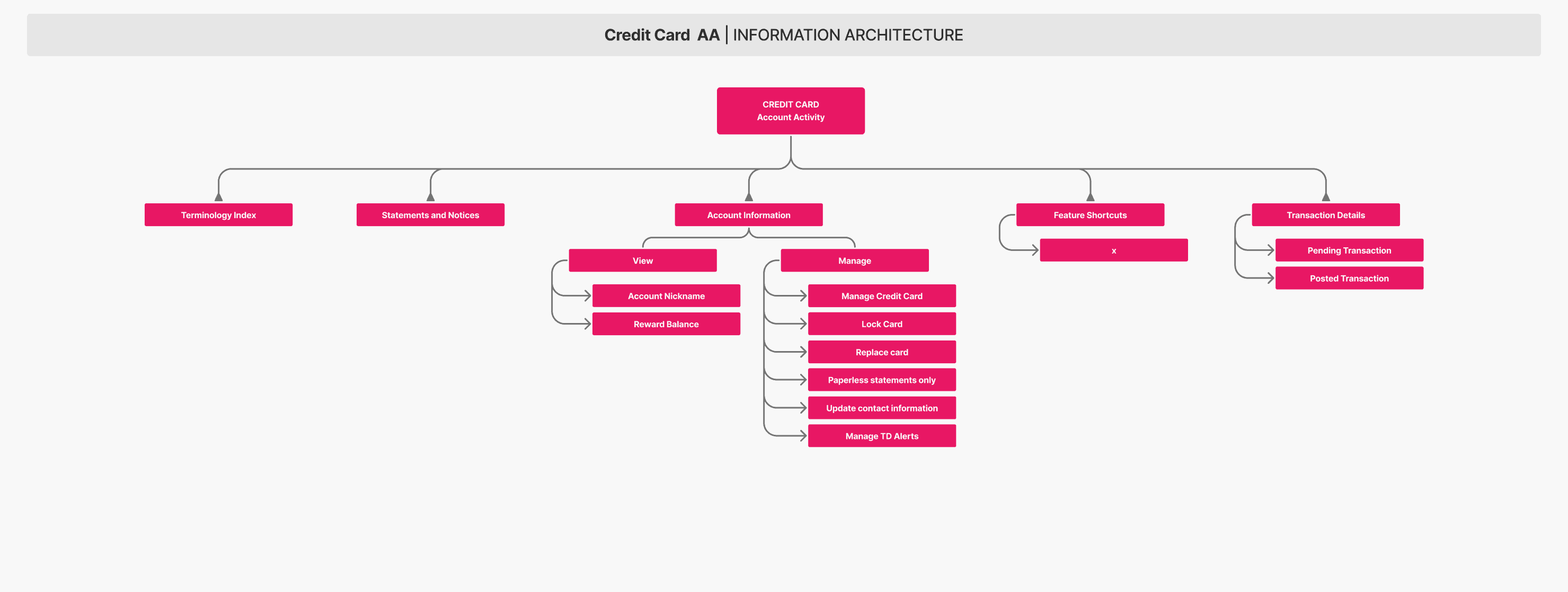

REASON OF USE
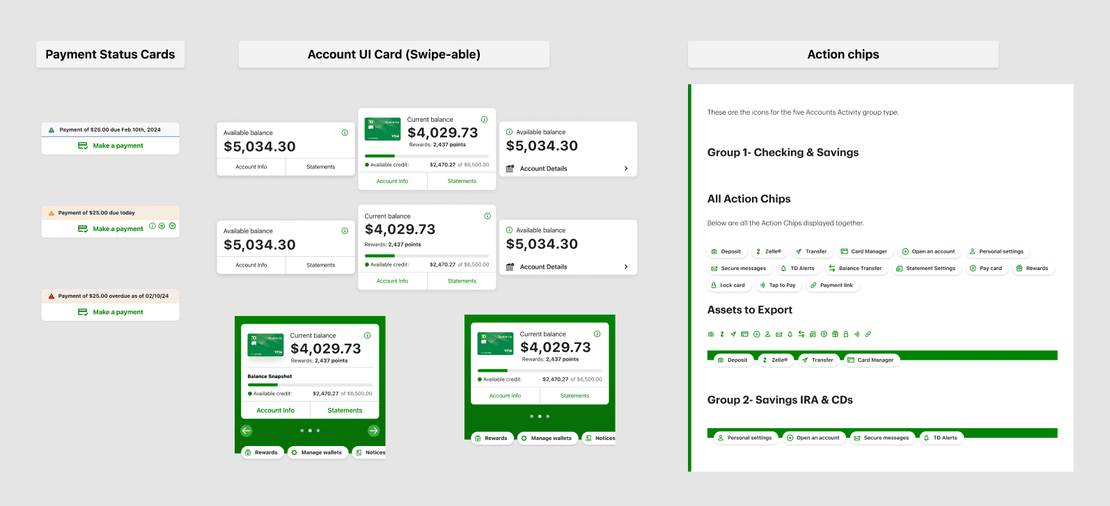
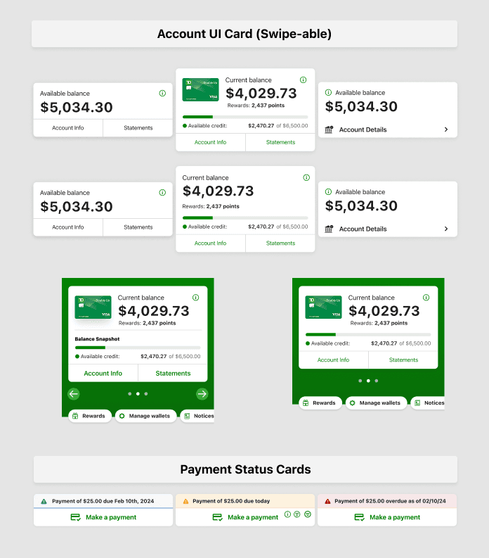
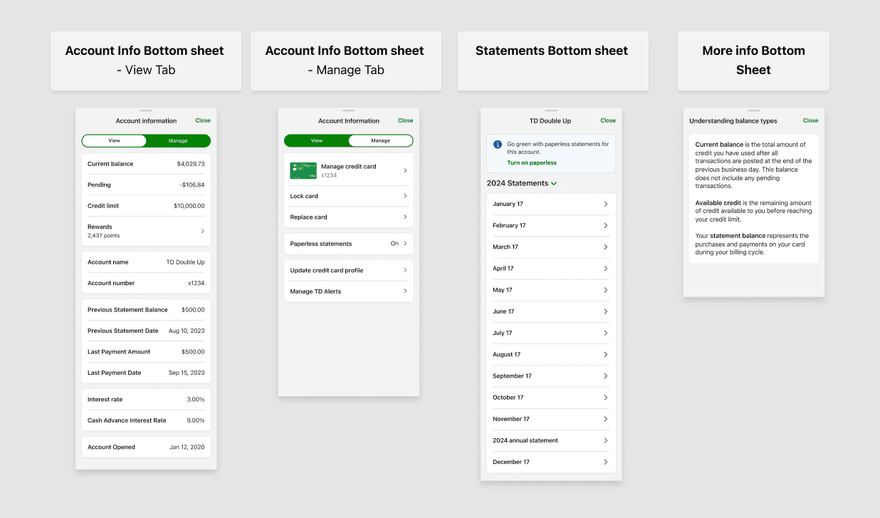
4. Modular Layout & Component Design
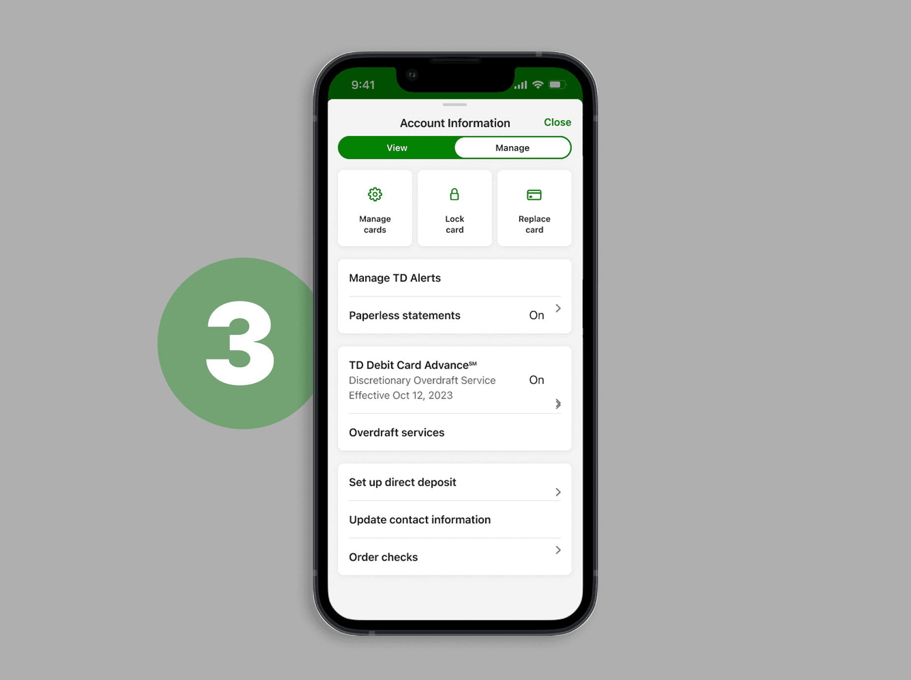
As part of the modernization effort, we introduced reusable components like:
Smart account cards (with embedded balance info)
Contextual action chips (e.g., Pay, Manage, Rewards)
Deep bottom sheets with segmented tabs (View / Manage)
Paperless CTA cards
We balanced platform-specific guidelines with system-wide consistency, designing for both Material 3 (Android) and Apple HIG (iOS).
REASON OF USE
5. Screen Flow Mapping
Once the IA and components were finalized (After mid fidelity designs were done), we mapped all happy-path flows and error paths—ensuring all users could accomplish key tasks like:
Viewing account info
Accessing statements
Flagging a transaction
Making a payment
Each screen was designed to support clarity and mobile-native interaction patterns.
REASON OF USE
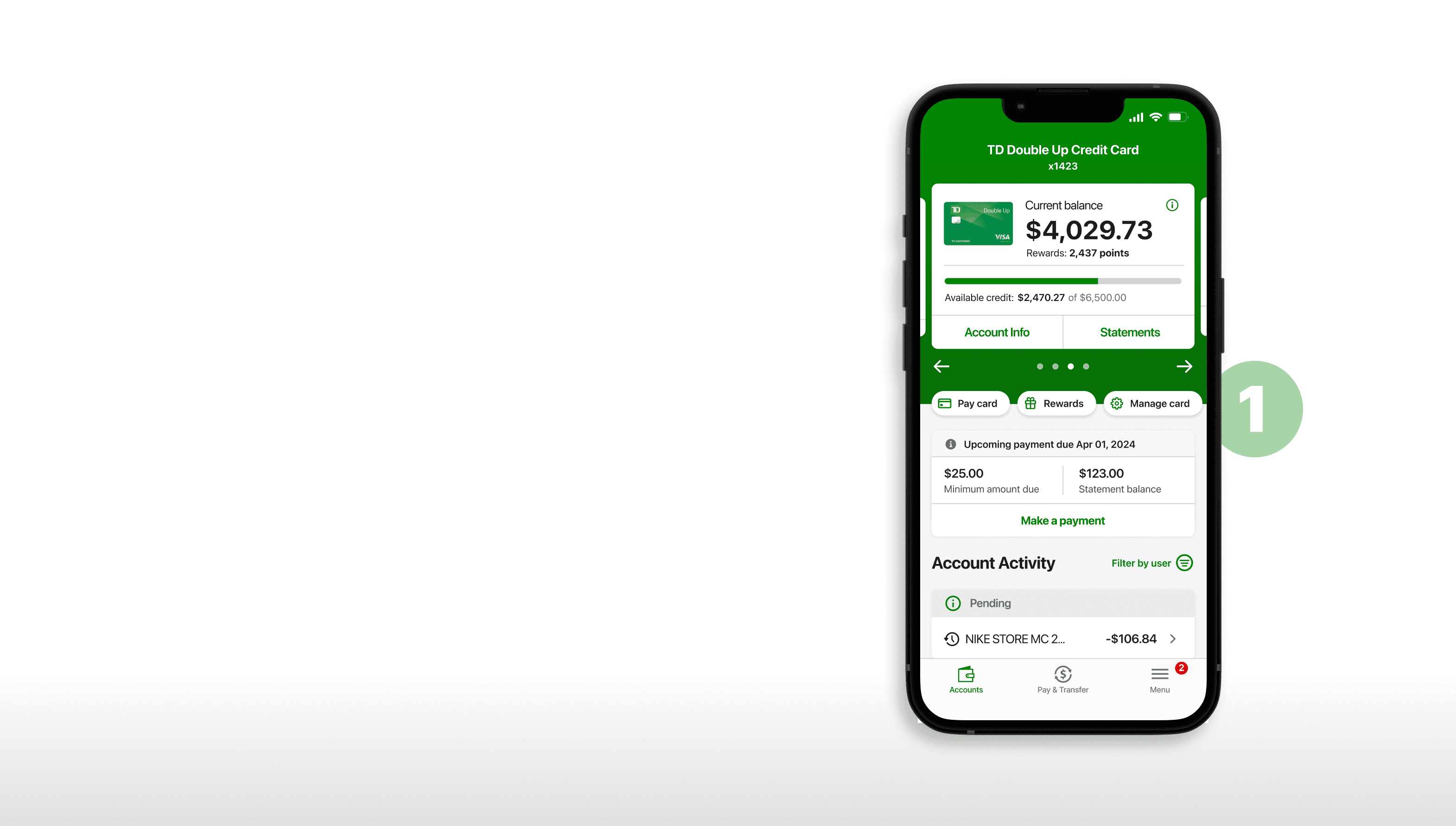
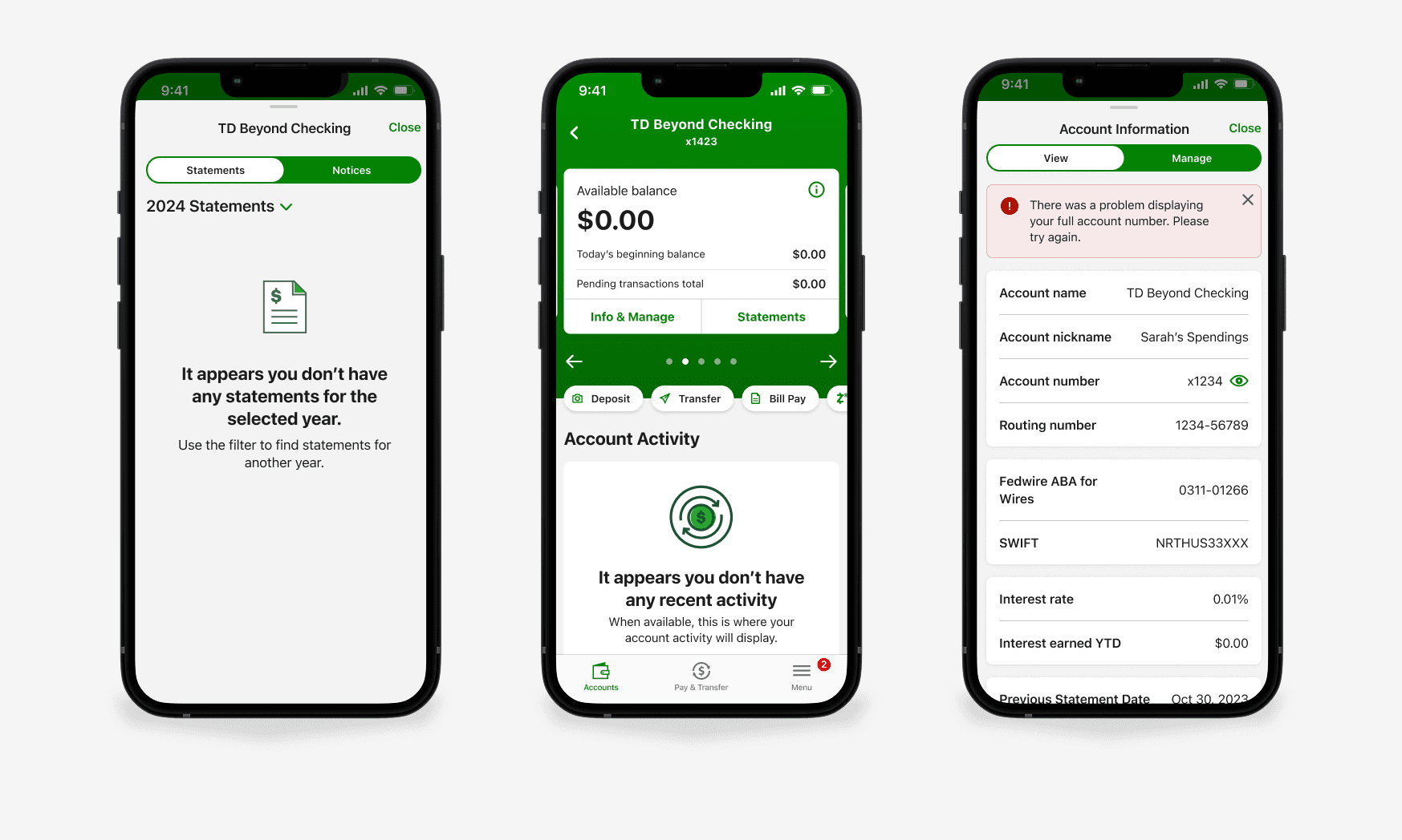
6. High-Fidelity UI Design (Multi-Account)
I designed pixel-perfect, responsive UI screens for all major account types and bottom sheets. This included:
Entry states
Scrollable interactions
Toggleable sensitive info
Visual status indicators for transactions
"Nothing to show" and other edge cases
NOTE
7. Error States & Edge Case Handling
Designing for broken states was just as important. I created screens for:
No recent activity
Failed statement loads
Missing routing info
Transaction flagging issues
These were tested during QA and refined with copy guidance from our UX writer.
“We ensured that even failure states felt helpful, informative, and calm.”

NOTE
8. Interactive Prototyping & Usability Testing
I built the fully interactive prototype in Figma, simulating real app behavior for our 10+ usability test participants.
This prototype was shared with the research team, who used it to conduct two weeks of heuristic testing.
REASON OF THIS STEP
9. Handoff to Dev & Visual QA
Once designs were finalized, I linked Figma frames to Jira tickets and reviewed all dev implementations via shared screenshots. I conducted visual QA to ensure pixel accuracy, checking every layout element, color, padding, and interaction.
REASON OF THIS STEP
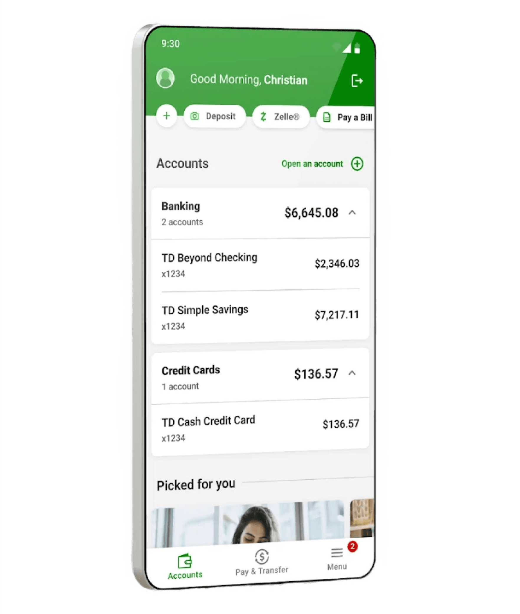
Impact & Outcomes
Users completed transaction lookups ~20% faster in usability tests after the redesign.
Support tickets for “missing transactions” decreased (anecdotal feedback from operations team).+19% increase in enrollments for paperless billing after redesign
Compliance banners integrated consistently, reducing legal and risk exposure.
Improved user trust and satisfaction, reflected in higher adoption of new account views across iOS and Android.
Faster Lookups
More Enrollments
Fewer Support Tickets
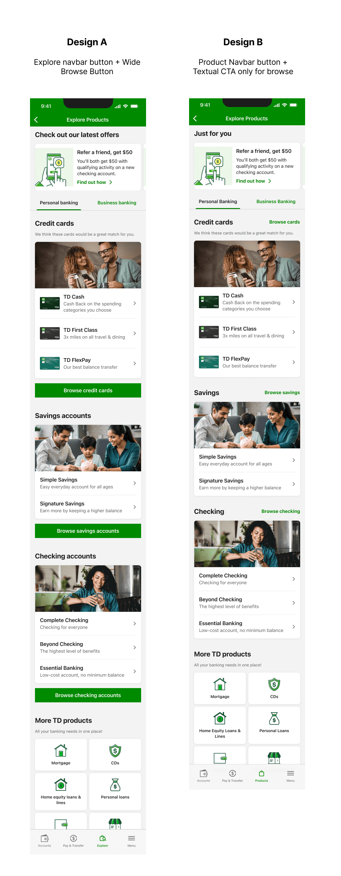
Low discoverability of products → TD products (credit cards, loans, insurance) were hidden behind text-heavy menus with minimal visual differentiation.
Banner blindness → Promotions relied on static banner placements that users often ignored due to clutter and poor hierarchy.
Unclear value propositions → Text-only layouts made it hard for users to understand what each product offered at a glance.
Inefficient navigation → Users had to drill through multiple layers of text links to get to detailed product pages.
Marketing bottleneck → Each new promotion required custom design and dev effort, slowing down marketing campaigns.
Lack of engagement data → Because of poor visibility, adoption metrics for financial products were underwhelming, and it was difficult to measure true user interest.
Accessibility gaps → Text-heavy, non-visual designs didn’t support inclusive, scannable experiences across all users.
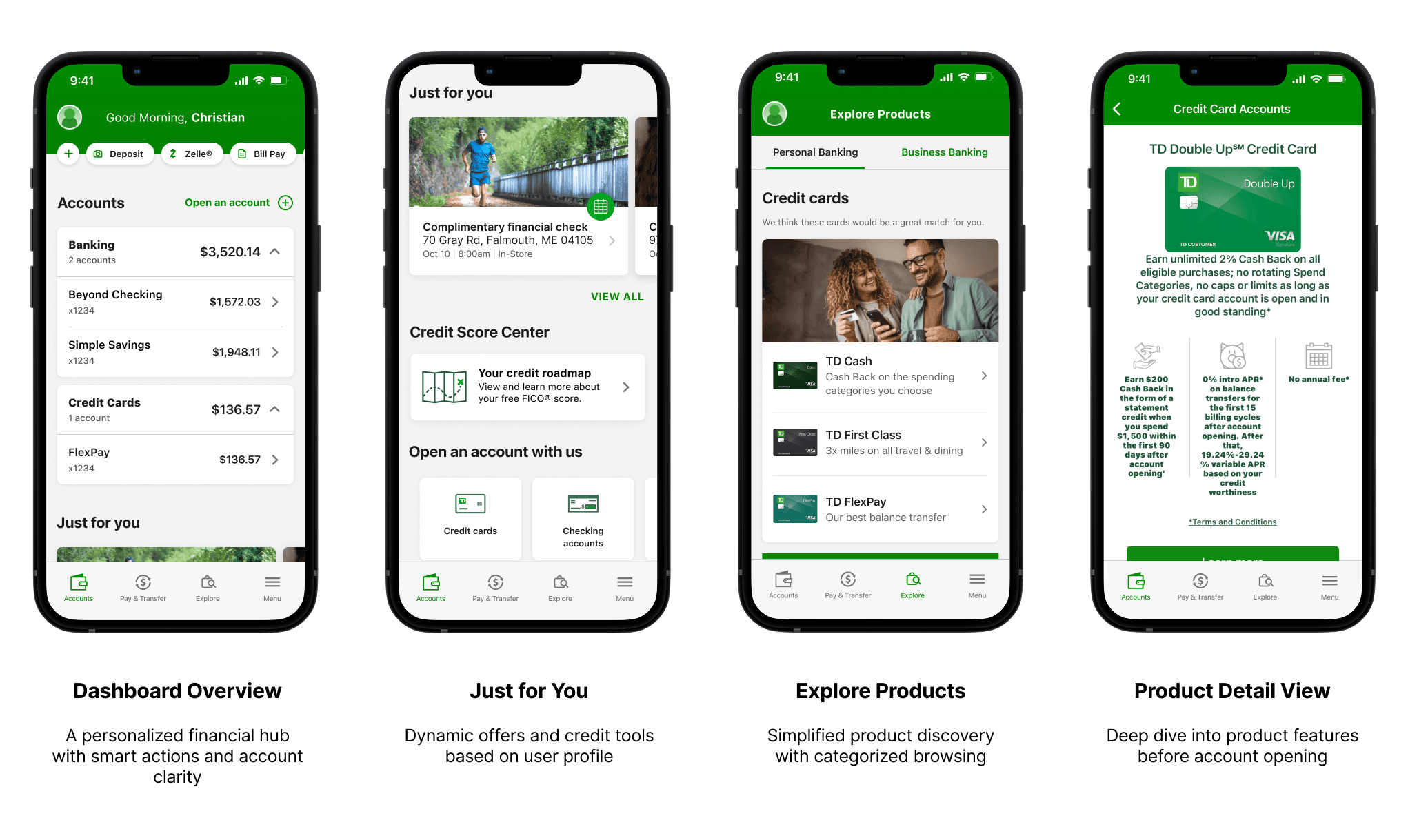
This design was a key strategic initiative to modernize TD Bank’s app experience and align the dashboard and product discovery flow with both user expectations and business objectives.
Business Goals
Modernize legacy app experience using the new design system and updated UI components, enhancing visual consistency and brand trust across platforms.
Increase visibility and uptake of banking products like checking accounts, savings, credit cards, loans, and mortgages by embedding them directly in the explore flow.
Boost conversions from mobile traffic by turning the dashboard into a marketing surface—featuring contextual offers, carousels, and CTAs for account opening.
Support cross-selling goals by surfacing more TD Bank products dynamically through the Explore section and curated carousels.
User Goals
Quickly scan transaction activity — users needed to understand their financial activity at a glance, without cognitive overload.
Access detailed transaction info easily — including date, merchant, location, and card used.
Feel confident handling sensitive info — toggleable account and routing details made users feel secure.
Navigate accounts intuitively — seamless flow between account type, details, and actions.
Minimize friction when opening or learning about new accounts — such as credit cards, savings, or loans — through improved navigation and card detail screens.
REFLECTION
By simplifying the layout and elevating contextual clarity, we met our user needs—swift scanning, confidence, easy access—while helping the business reduce friction, scale design, and drive behavior change.
Requirements Mapping & Information Architecture
To ensure consistency and scalability across the TD app ecosystem, we adopted the same modular design system and process used in the Account Activity redesign. Key UX and IA principles included:Structuring content into clear, scrollable sections (e.g. accounts, credit score, personalized offers)
Prioritizing high-frequency actions (e.g. Zelle, Deposit, Bill Pay) via smart action chips
Designing card-based modules for account types and product discovery
Streamlining access to product exploration from key touchpoints (e.g. "Open an Account" buttons)
Ensuring visual hierarchy and spacing for intuitive scanning and decision-making
Leveraging reusable components to support both dashboard and shopping flows
This approach helped unify the experience across multiple entry points while reducing cognitive load for users.
REASON OF USE
3. Modular Layout & Component Design
As part of the modernization effort, we introduced reusable components like:
Smart account cards (with embedded balance info)
Contextual action chips (e.g., Pay, Manage, Rewards)
Deep bottom sheets with segmented tabs (View / Manage)
Paperless CTA cards
We balanced platform-specific guidelines with system-wide consistency, designing for both Material 3 (Android) and Apple HIG (iOS).
REASON OF USE
5. High-Fidelity UI Design (Multi-Account)
I designed pixel-perfect, responsive UI screens for all major account types and bottom sheets. This included:
Entry states
Scrollable interactions
Toggleable sensitive info
Visual status indicators for transactions
"Nothing to show" and other edge cases
NOTE
6. Interactive Prototyping & Usability Testing
I built the fully interactive prototype in Figma, simulating real app behavior for our 10+ usability test participants.
This prototype was shared with the research team, who used it to conduct two weeks of heuristic testing.
REASON OF THIS STEP
Business Impact
+36% increase in product exploration within the first 4 weeks, as users engaged more with the new card-based Explore section compared to the old text-heavy shopping flow.
30% reduction in support queries related to unclear balances and product visibility, showing that improved hierarchy and clearer calls-to-action reduced confusion.
40% higher engagement with personalized product cards (e.g., TD Cash, Credit Score Center) on the homepage, leveraging the new modular card system across multiple product categories.
18% boost in “Open an Account” conversions from redesigned dashboard CTA buttons, proving the new layouts improved visibility and trust.
Introduced a scalable product discovery system → modular components now reused across onboarding, marketing promotions, and other TD flows, cutting down design + dev effort.
Accessibility improvements baked in (contrast, touch targets, screen reader labels) ensured that engagement increases were inclusive and sustainable.
Increase in product exploration actions via the new “Explore” section within the first 4 weeks
higher engagement with personalized product cards (e.g. TD Cash, Credit Score Center) on the homepage
boost in conversions for “Open an Account” from dashboard CTA buttons